UX First: Why We Killed the Bottle Slider
Designing a baby tracker that actually works at 3 AM with one hand.

When building Weeweelu, the user experience wasn't just a feature—it was the highest priority. There are already a bunch of baby tracking apps out there, but we wanted to fix the common problems that plagued them and make something genuinely practical for everyday (and every-night) use.
The One-Handed Rule
If you're tracking a feeding or a sleep session, chances are you only have one hand available. For instance, your other arm might often be busy holding a baby.
In many existing apps, the textbox for entering milk amounts is stubbornly placed at the upper part of the phone screen—practically impossible to reach with a thumb if you're trying to navigate single-handedly.
Then there's the textbox component itself. It's a UX nightmare when you're sleep-deprived: tap the box, wait for the virtual keyboard to slide up, type the number, close the keyboard (because it's hiding the save button), and finally click save. It's simply not practical, yet it's incredibly common across the market.
There are apps that let you track all kinds of data, but the UX matters, and it isn't always great. In Weeweelu, we wanted something that allowed for fast, effortless action.
Phase 1: The Custom Bottle Slider
When working on the mobile version of the app, our first approach was to just copy what we did for the web version—building a custom bottle slider.
On paper, it was a great idea. It looked pretty nice with the fluid animation, was fun to use, and felt very intuitive. But a good-looking UI component doesn't always translate to a usable one in the real world. After testing it a few times in actual feeding scenarios, we noticed a glaring issue: it wasn't easy to select the exact amount you wanted on the first try.
First off, the bottle slider was small and lacked measurement ticks. The most frustrating part? You would finally get the slider to the right spot, but the moment you released your finger, the slider would accidentally move slightly, ruining the input.
Phase 2: Speed and Precision
We had to redesign the approach. We scrapped the slider and implemented common amount buttons (30ml, 40ml, etc.).
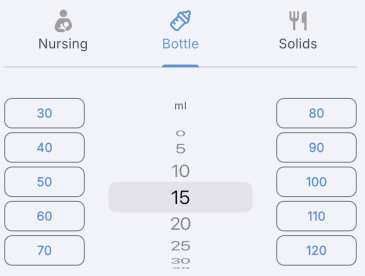
This changed everything. Now, it takes exactly two taps for a user to save a feeding session: select the amount button, and hit save.
For those times when you need more granular control, we added an optional wheel control. This allows users to quickly dial in a value in 5ml increments or easily log higher amounts of milk without ever battling a virtual keyboard.
Practicality Over Polish
Redesigning the milk input was just one example. We took this exact same UX philosophy and applied it throughout the entirety of Weeweelu. Whether you are logging a diaper change, starting a sleep timer, or tracking growth milestones, the core principle remains the same: minimize friction.
We wanted to ensure that users can get in, log the data with as few taps as possible, and get back to their day. Ultimately, practicality, speed, and single-handed accessibility will always beat out flashy UI components.